MoMA
Posts in ‘Design’
January 24, 2011  |  Collection & Exhibitions, Design
Digital Fonts: 23 New Faces in MoMA’s Collection

Matthew Carter's Walker

MoMA has just acquired 23 digital typefaces for its Architecture and Design Collection. Some are of everyday use, like Verdana; others are familiar characters in our world, like Gotham, which was used in President Obama’s election campaign, or OCR-A, which we can find at the bottom of any product’s bar code; and others are still less common, but exquisitely resonant, like Walker or Template Gothic.

November 18, 2010  |  Collection & Exhibitions, Design, Tech
It Takes a Village to Create an Exhibition…App

If you’ve followed this blog for a while, you may already have the sense that a lot of people are involved in putting together an exhibition. Curators, preparators, conservators, exhibition designers, registrars, security, and others all have critical roles to play in what you see at the Museum. But what happens when you take the same approach when putting together an exhibition app?

October 15, 2010  |  Collection & Exhibitions, Design
New Polish Posters

Tomasz Sarnecki. Solidarność (Solidarity). 1989

I was raised on Westerns—The Rifleman, Hondo, Wyatt Earp, Cheyenne, and Lawman, with plenty of John Ford and Sergio Leone thrown in, and I just adored those cowboys.

October 8, 2010  |  Design, Rising Currents
Rising Currents, Rising Standards: Graphic Design Takes Up the Challenge

Rising Currents exhibition entrance.The exhibition's graphic design was made to appear similar to blueprints, the mode of graphic communication among architects and builders. Photo: Jason Mandella

Rising Currents: Projects for New York’s Waterfront is a unique exhibition for its subject matter, but also because of the process of putting together the exhibition. As graphic designers, it was heartwarming to have the full support of both the curator and the exhibition designer throughout the entire process. We were particularly gratified to be given the opportunity to take take our creativity beyond the title wall and into the individual displays—yeah!

September 24, 2010  |  Collection & Exhibitions, Counter Space, Design
A Counter Space Odyssey

I find that the process of many design jobs is a journey between two extremes, both of which are usually to be avoided, but if you strike the right balance, you end up in some interesting places. Finding the graphic identity for the exhibition Counter Space: Design and the Modern Kitchen</a> was a classic example.

August 19, 2010  |  Artists, Collection & Exhibitions, Design
MA at MoMA

Alexander (Sándor) Bortnyik. Ma VII - IK (Grafikai) Kiállitása. 1919

While we always believe in the works we propose for addition to the MoMA collection, some works stand apart in extraordinarily strong ways. They speak to us because of their great historical significance, aesthetic power or, in my case with the above poster, because of true love.

July 1, 2010  |  Design
MoMA by Hand
Working in MoMA’s Department of Graphic Design, the iconic shape of our logo has been permanently burnt into my mind. Maybe that’s why, on my daily errands through the Museum—to the frameshop in the subcellar, past painters’ scaffolding in a gallery, to the audiovisual department to borrow a screen for a presentation—I am always startled by hand-drawn MoMA logos.
Protect Me from What I Want


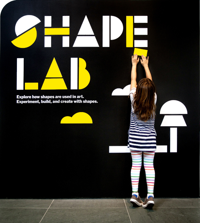
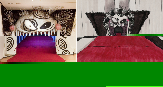
In previous posts we’ve showcased exhibition and wayfinding graphic developments and looked at interesting ephemera created by the Graphic Design department throughout MoMA’s past. This post is about a much more humble, but extremely important, type of design: the warning sign. These signs are created for a wide range of purposes—to prevent overcrowding in the galleries, to prevent damage to the artwork or Museum spaces, to alert people about potentially controversial artworks in the galleries, etc.—and they represent a collaboration between Graphic Design and the Curatorial, Legal, Visitor Services, and/or Education departments. Some signs, such as room-capacity notices, are required by law; others, such as the “warning” notices at the entrance to the Marina Abramović exhibition, are more of a courtesy. They all have one thing in common: they’re designed to make sure each guest has a safe and fun time at MoMA. The slide show above includes just a few of the signs we’ve made over the years. Enjoy… at your own risk!

April 26, 2010  |  Design, Events & Programs
Magnetic MoMA: A Graphic Look at Shape Lab

The yellow shapes are movable magnets, which can be repositioned to fit into the small forest scene at bottom right. Photo by Michael Nagle

When we first met with the educators from MoMA’s Education Department to discuss the Shape Lab installation, we knew instantly that this project had to be FUN for us, the designers—and that FUN needed to be part of the design for the visitors.

Shape Lab is an interactive educational space for families. The educators’ intention for this space is to encourage visitors to interact with the space and explore the different ways artists use shapes in painting and sculpture. The space was filled with interactive tools and furniture, educational toys, art books, and shape learning activities. The original project request was to design an identity for its title wall. Instead, we designed a multifunctional activity wall, which both communicates its message and functions as a fun learning game.

April 19, 2010  |  Collection & Exhibitions, Design, Film
3D Burton: Shadows and Reflections

Three-dimensional rendering of the entrance to Tim Burton (left) by TwoSeven, Inc., based on an untitled drawing (right) by Tim Burton for the unrealized project Trick or Treat (1980)

Tim Burton was one of the most challenging exhibitions our graphic design department has had the pleasure of fully developing. It explores a wide spectrum of Tim Burton’s creative work, including drawings, paintings, photographs, moving images, concept art, storyboards, puppets, maquettes, costumes, and cinematic ephemera. For the exhibition graphic design, our goal was to take all these diverse visual references and distill them into a simple graphic treatment that celebrated Burton’s work.