Designer, Margaret Calvert: Designing is about answering the right question. The whole system was designed from the point of view of the driver and very important, obviously, was the legibility.
My name’s Margaret Calvert and I am a graphic designer and typographer. I worked with Jock Kinneir on the UK Road Signs in the early ’60s.
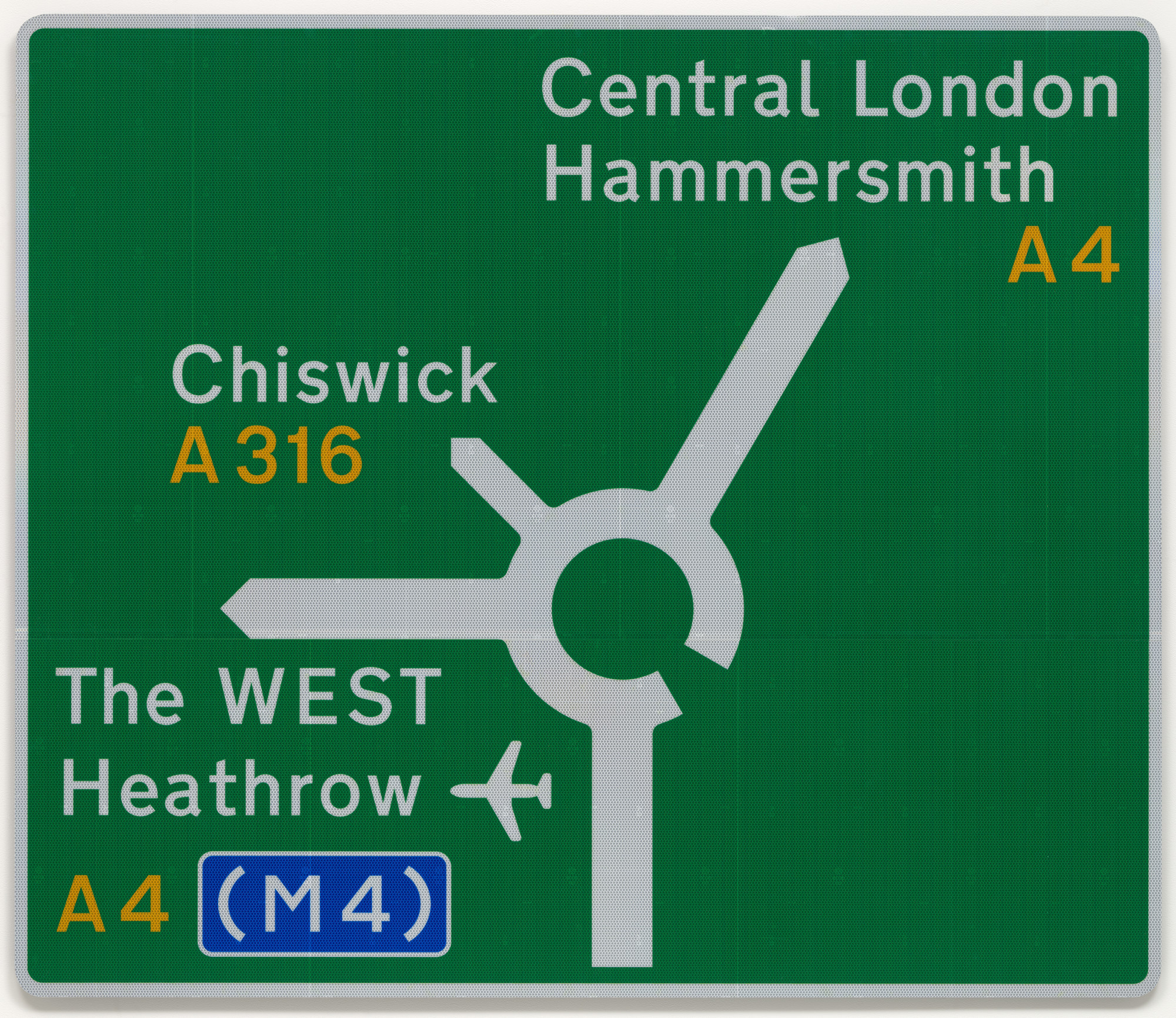
What you’re seeing is a roundabout sign, which is white on green and the route numbers are in yellow. The colors are all chosen to be the most noticeable from a distance. The thickness of the stroke in the diagram is related to the importance of the road. So minor roads were thinner and major ones were thicker. And they have no arrow at the end—it's just pointed. So simplicity was what we were driving at.
The most important thing about the whole system was the upper and lower case lettering. Place names all used to be in capitals. But in capitals, you have to read each individual letter form, whereas, in upper and lower case lettering, you read the shape of a word. So there was the enormous advantage of using upper and lowercase lettering. And there was some opposition. But in the end, modernism won because it was very clear and very simple.
You never set out to design anything iconic, but you just simply put yourself into it. If it works for you, then hopefully it works for a larger audience.